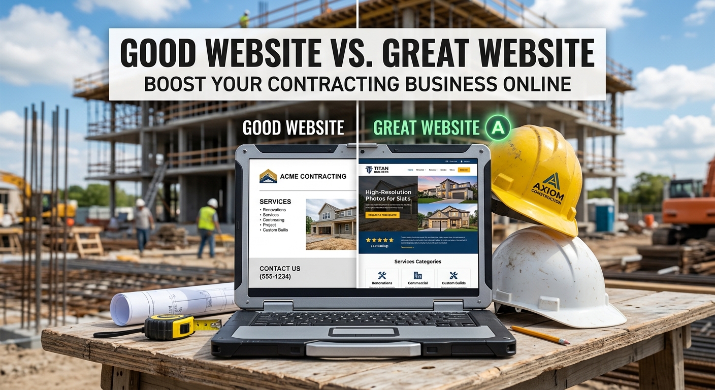
Good contractor websites vs great ones
Most home service websites are not broken. They load, they have a logo, they have a contact page. A homeowner can tell the company exists. That is a good website. It is also how jobs go to the next name in the map pack.
A great website is designed for a person standing in a driveway with one bar, not for the owner on office wifi. The first screen answers what you do, where you do it, and how to reach you. Type is readable. Buttons are thumb-sized. Photos are yours. The form is short enough to finish. Nothing decorative is sitting in the way of the call.
Templates fail this on purpose. They are built to look finished in a demo, with a hero slideshow, six equal columns, and a phone number hiding in a menu. The customer never sees the version you approved on a 27-inch monitor.
This is the teardown we run: what "good" looks like, what "great" adds, the design principles that actually change whether they tap, public research behind those principles, what to check this week, and how GoodLeed builds the second kind as the default.
What a homeowner is doing on your site
They did not sit down to browse. Google's consumer research with Ipsos found that 76% of people who search on a smartphone for something nearby visit a related business within a day, and 28% of those nearby searches result in a purchase. Same-day intent.
BrightLocal's Consumer Search Behavior research (April 2025, 1,000 US adults) found that 85% of consumers consider contact information and opening hours important when researching a local business. Fifty-six percent often or always check that the information matches other mentions online. Sixty-seven percent often or always look at reviews after a local search.
Invoca's 2025 call-conversion benchmarks put home services at a 46% conversion rate on the phone, the highest industry in that report. Unbounce's 2024 Conversion Benchmark Report (41,000 landing pages) puts commercial and professional services at a 6.1% median conversion rate. Repair and maintenance pages convert at nearly three times the rate of home-renovation pages. Urgency is the multiplier. A burst pipe does not need a brand story. It needs a layout that puts a number under their thumb.
Design principles that separate good from great
Pretty is not a principle. These are.
1. The first screen does one job
Nielsen Norman Group's eyetracking work (the F-shaped pattern, 2006, confirmed in a later study of 232 people across thousands of pages) is still the useful finding: people scan. They read across the top, a shorter pass lower down, then down the left. They do not read your mission paragraph.
Good: a full-bleed photo and the company name. Great: trade and town in the first line, a tappable number or one primary button, and nothing else competing for that first glance. "Same-day HVAC repair in Tampa" plus Call now beats a slider of three stock attics. One obvious next step per page. Traffic that does not call is a hobby.
2. Design for the thumb, not the mouse
Google's Material guidance and web.dev both put the useful tap target at about 48 by 48 CSS pixels, roughly 9mm, with about 8 pixels of space between targets so a finger does not hit two things at once. WCAG 2.5.5 (AAA) asks for 44 by 44. Tiny "Call" text in a header, or two pill links jammed together, fails this on a phone even when it looks fine on a desktop.
Great sites keep the number outside the hamburger. A menu that swallows the only action is a design error, not a mobile convention. If you use a sticky call bar, it cannot cover the form submit button, and it cannot steal clicks from the rest of the page. That is a real layout bug, not a taste issue.
3. Hierarchy, type, and contrast
WCAG 2.1 contrast (minimum), Level AA, is 4.5:1 for body text and 3:1 for large text. Light gray on a photograph fails this and fails older eyes in a driveway at dusk. Body copy needs a size you can read without pinching. Do not lock zoom with user-scalable=no or maximum-scale=1. That fails WCAG 1.4.4 (resize text). The viewport tag should be width=device-width, initial-scale=1 and nothing that fights the user.
Pair a display face for headings with a clean body face, and keep a real scale: large, tight headlines; body around 16px with line-height near 1.5 to 1.7. Unstyled system fonts for everything is how a template looks like a template. A rainbow of card shadows is decoration, not hierarchy. One accent, used on the action, is enough.
NN/G's later work on scanning is the practical writing rule: short headings that mean something, bullets, first words that carry the point. A wall of "we are passionate about quality" gets the F-pattern and none of the call.
4. Photos that could only be your shop
Stock photography is the fastest way to look like every other WordPress demo. Great sites use trucks, jobs, faces, and before-and-afters from work you finished. Compress them. A 4MB hero is how you join Google's 19-second mobile club from "The Need for Mobile Speed" (about 3,700 sites, March 2016), where 53% of visits were abandoned after three seconds. Real photos, sized for a phone, beat a cinematic loop that never starts.
Alt text is not optional on those images. It is how a screen reader, and often a search engine, knows what the picture is. "IMG_4032" is not alt text.
5. Forms people will finish
Baymard's checkout research is ecommerce, and the mechanism still applies: the more empty fields you show, the worse the experience, and 18% of users in their abandonment work cite a process that is too long or complicated. They also find multi-column forms harder to complete. A contractor form that asks for company name, fax, how you heard about us, and a 12-field address is designed for the office, not for a wet basement.
Great: name, phone, maybe email, maybe a photo upload, one column, labels outside the fields, a submit target at least 48px tall. Ask for the phone because that is how you book the job, and say so. Do not split name into three boxes.
6. Pages as a sequence, not a collage
A homepage that is six equal service cards, a 12-image carousel, a map, a blog teaser, and three CTAs is a collage. Great sites stack: offer, proof (reviews and jobs), how it works, a short form or the number again. Service pages are their own layouts, not the homepage copied with the H1 swapped. Internal links go to the page that books that job.
Desktop can be an editorial grid. Mobile is a single column that does not require sideways scroll. Horizontal overflow in a fixed header is lost content. Nobody discovers it.
7. Motion only where it earns its place
A hero video, a bounce animation on every card, and a chat bubble that covers the number are how a site feels busy and converts less. Respect prefers-reduced-motion. If something moves, it should be one moment (a page load, a button state), not a carnival. Keyboard focus has to be visible on every control. A skip link to main content is the same idea: get the person who cannot use a mouse to the offer, not through 14 nav links.
The rest of the teardown (good vs great)
The site answers. Good: it loads. Great: HTTPS, padlock, no "Not secure" next to a form. Google has treated HTTPS as a ranking signal since 2014. The conversion cost is the homeowner who will not type a number into a flagged page.
Speed. Good: it appears. Great: mobile PageSpeed in the green. Google's 53% figure still describes what happens when the first screen takes more than three seconds.
The phone number. Good: in the footer. Great: on every page, tel: link, outside the menu.
After hours. Good: a contact page. Great: a short form or chat on the landing page that someone will see. A form that emails an inbox until morning is a second voicemail.
Markup Google can read. Good: a homepage. Great: one H1, a title you wrote, LocalBusiness markup matching the Google profile, including LLC if that is on the door.
After they act. Good: a thank-you page. Great: wired to a 60-second response. A beautiful site that hands the lead to nobody is the most common failure we find, and it is usually not the pixels' fault.
What to check this week
Do it on your phone, on cellular, not on the office desktop.
- First screen, no scrolling: trade, town, and a tappable Call. If the number is behind a menu, it fails.
- Tap every button and the phone number. If you miss, the target is too small. Aim for 48px.
- Pinch-zoom. If the page refuses, the viewport is fighting WCAG.
- Read a paragraph of body copy in daylight. If you cannot, contrast or type size is wrong. Check 4.5:1 for body text.
- Count stock vs real photos. Replace three fakes. Compress the hero until PageSpeed mobile is out of the red.
- Count form fields. Cut everything that is not name, phone, and what they need. One column.
- Submit the form after 6pm from a personal address. Clock the reply.
- Tab through the page on a desktop. If you cannot see where you are, there is no focus state.
The Local Growth Scorecard already grades reachability, HTTPS, title, markup, viewport, tap-to-call, visible number, form, chat, and PageSpeed. It cannot grade whether your Call button is 32px of gray text. That is this list. The live after-hours test is still the Deep Audit.
How GoodLeed designs this
We do not assemble templates. GoodLeed's public web-design page says it plainly: no WordPress, no page builder, no plugin stack to keep patched. Every plugin is a thing that breaks, slows the page, or needs an update nobody is doing. Client sites are hand-coded, hosted, and maintained.
The design contract is specific to the shop, not a theme: navy and paper, one orange for the action, a display face plus a readable body, sentence case, tap targets that work, visible focus, skip to content. PageSpeed on goodleed.com is the build standard. 100 on Google's SEO and Best Practices checks is the floor because you can run it yourself. Phone number tappable on every screen, one obvious next step per page, forms short enough that people finish them.
The site is not a standalone deliverable. Forms and calls land in the same engine that answers in under 60 seconds, follows up for days, and asks for the review when the job wraps. Hosting and changes stay ours to fix. If you need a new site, the one-time build is quoted up front. Sometimes the audit says fix, not rebuild.
Great is not a mood board. It is a layout that still works in a driveway, stays fast, and stays wired to the answer.
Website design FAQs
Do I need a redesign or a few layout fixes?
If mobile speed is in the 40s, the number is in the menu, and the hero is a slideshow, you are usually looking at a rebuild. If the structure is sound and the Call target is small, fix the header and the form first. The $97 audit is how we tell those apart, including what happens when someone actually tries to reach you.
Is a sticky click-to-call bar required?
Only if it does not hide the rest of the page or steal taps. A number already in the header, always visible, often does the job with less chrome. Sticky is a tactic. Thumb-sized, always available is the principle.
Can we keep the current brand colors?
Yes, if body text still meets 4.5:1 and the primary button is still obvious on a phone. A pale logo on a pale photo is not branding. It is unreadable. We will say so rather than "make it pop."
Why not a page builder so I can edit it myself?
Because the version you can edit is the version that accumulates plugins, giant images, and a 4-second paint. We host and change it. You do not get a login and a wish of good luck. The site that never gets updated is the one that quietly stops working.